
Pickering Safety (Revamp)
Web development can change rapidly, and keeping up with the current design trends and best practices is one of our key goals. To that end, and mobile-friendly redesign of Pickering Safety was recently re-launched as part of an ongoing process to meet and exceed Google’s demand for mobile and user-friendly websites. In addition to now being easy to browse and use from a mobile device, part of the initiative was to improve upon every aspect of the site if possible – be on the lookout for the new smart-search feature, card-based material design aesthetics, and overall site speed as new features for this incredible client’s website.
- Online Marketing, Website Design, Website Development
Website Technologies Used
« Back to Portfolio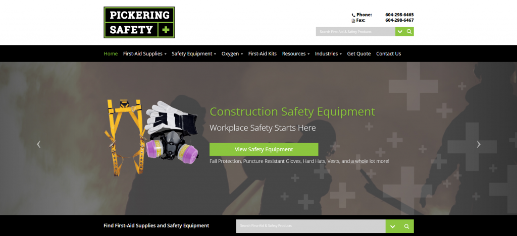
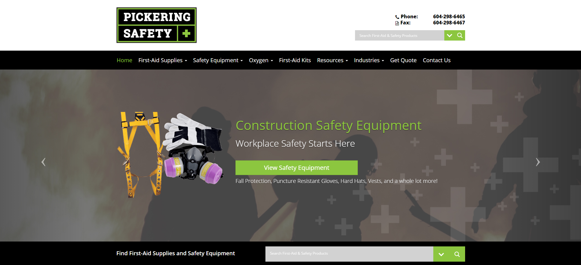
The front-page is styled to be user-friendly, with the smart-search featuring prominently for quick product look-ups.
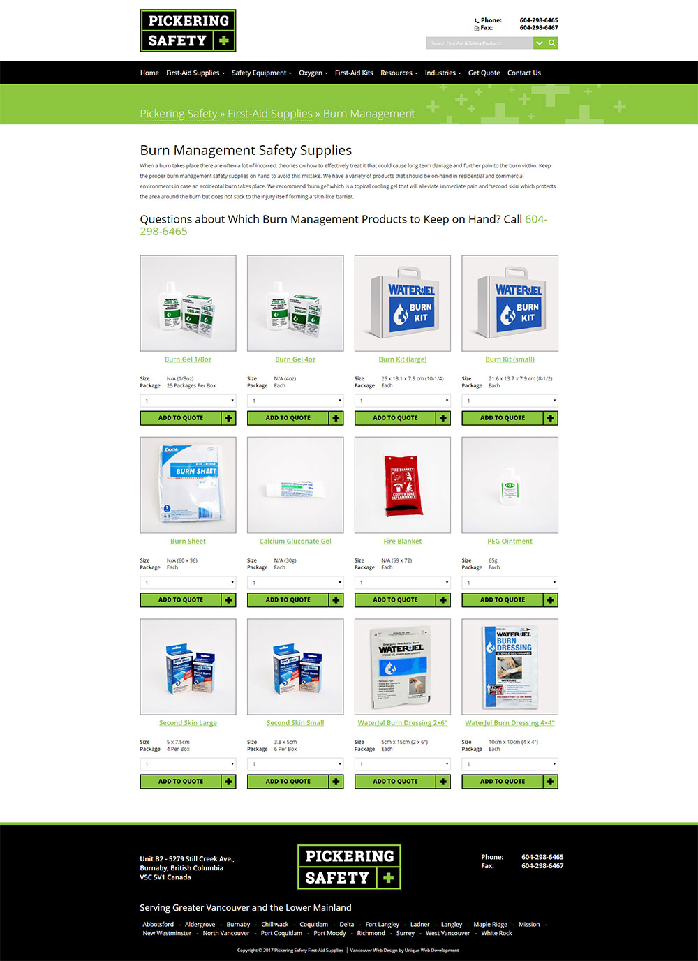
The product page has been re-styled to a material-design perspective. The layout allows for easy browsing and reading of details of each product, with quick-add being available for each product.
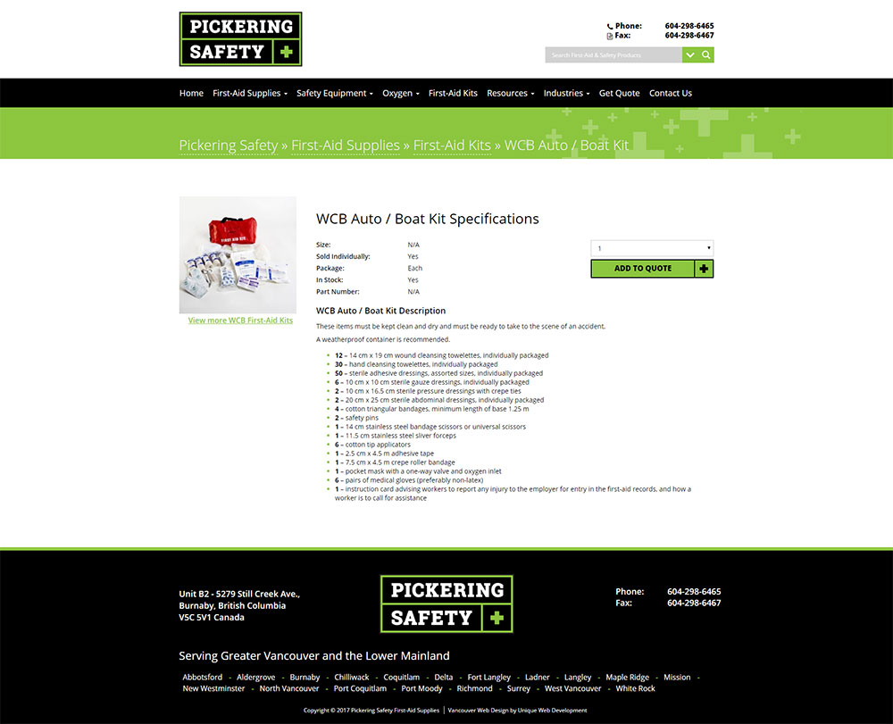
Like the category view before it, the single product page is designed for ease-of-use and function. All of the information is available at a glance, and the quick-add function is retained.
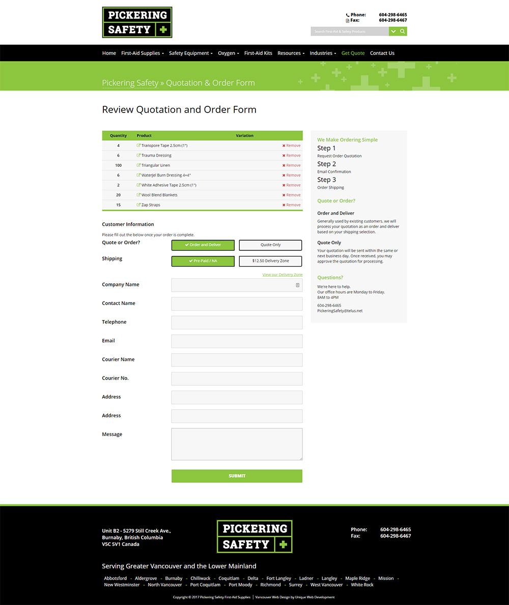
Finally, when the user is ready to check-out, an intuitive, clean form is presented to them, as well as quick links and removal to adjust their purchases as desired.